
Short Answer
Ceramic dinnerware color photos can differ from samples because lighting, camera settings, reflections, and screens change what you see. Bulk pieces can also differ physically because glaze thickness, clay body, and firing affect color. Use photos to review direction and visible issues, then approve actual fired samples and a clear shade range under agreed lighting before production.
When a buyer sends me two pictures and asks which plate is the correct green, my first question is simple: were they photographed together?
I understand the worry. You chose a calm sage color, and the latest image looks almost blue. But asking the factory to adjust the glaze immediately can turn a photography problem into a production problem. I prefer to establish what changed before changing the ceramic.
Here are five assumptions I would put aside, followed by a photo approval checklist you can use with your supplier.
Myth 1: A Better Camera Gives Us an Exact Color Standard
A good camera can produce a useful record. It does not remove the effect of the light falling on the plate.
White balance adjusts how a camera represents the color of the light. Automatic settings may change between shots. A pale plate beside a dark background can also lead the camera to choose a different exposure.
My practical rule is to photograph the retained reference and the new sample together. Keep them at the same angle and under the same light. Include a proper neutral gray reference card in the setup image, rather than assuming a white sheet of paper is neutral.
Ask for the original image file, the light source, and whether exposure and white balance were held steady. A supplier who shares the setup has given you something useful to repeat. “Our camera is very expensive” does not answer the question.
For glaze photography, I want one view that shows the overall color and another that shows the surface reflection. A glossy plate can look pale where a large light reflects in it. Moving the light may reveal the underlying color, but it also changes how the finish appears. Keep both views.
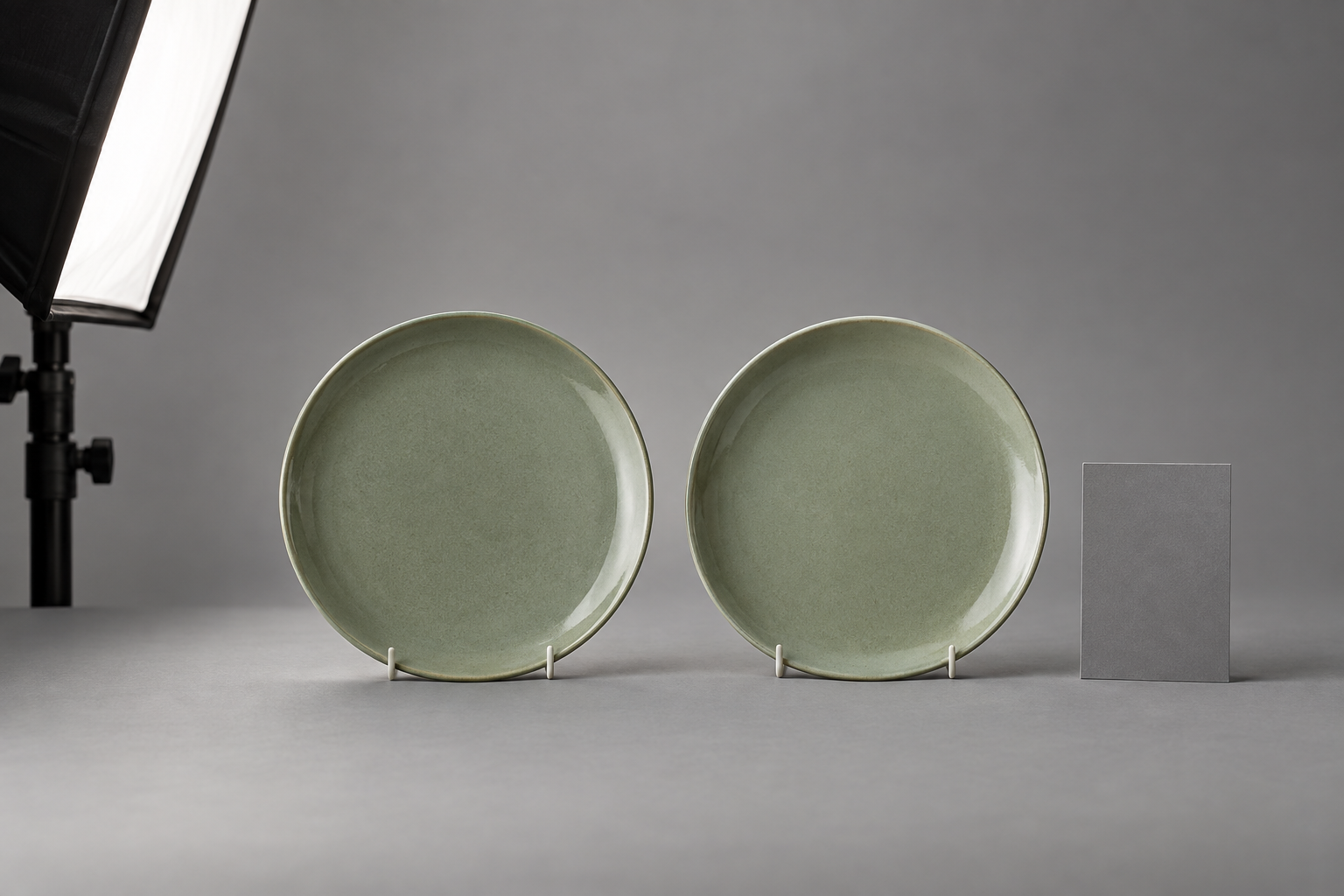
Photograph the reference and candidate together before judging a shade difference.
Myth 2: If Our Screens Match, the Physical Plates Will Match
A screen emits light. A plate reflects it. The two are different viewing experiences.
Display calibration and a suitable profile help a monitor represent an image consistently. They do not prove that the photographed sample matches a ceramic standard. A poorly captured image can still be displayed very consistently.
For team reviews, use a stable viewing environment and avoid automatic warm-screen modes. Ask the photographer to provide a properly converted, profile-tagged file, commonly sRGB for web review. Keep the original as well. Screenshots passed through several messages make the file history harder to follow.
I would not approve a final glaze match because three colleagues like it on their phones. Instead, have the person responsible for color review the physical approval pieces. Record who approved them, when, and under which lighting.
A digital color code is useful for starting a conversation. It cannot describe the full appearance of a curved, glossy, speckled ceramic surface.
Myth 3: Every Photo Mismatch Is Just the Lighting
Sometimes the glaze really is different. This is where I stop discussing screens and compare the objects.
Glaze thickness can affect fired color, especially in transparent colored glazes. A deeper layer may look darker than a thinner one. On a curved piece, glaze may collect near the lower wall while the rim looks lighter. The clay beneath a transparent glaze also contributes to its appearance.
Firing conditions and cooling can change some glaze effects. That is why I ask whether the new sample used the intended body, glaze application, and production firing route. A studio trial is helpful for development, but it does not establish what the production line will deliver.
Compare the same zones: food well against food well, rim against rim, and bowl wall against bowl wall. Do not compare a plate’s bright reflection with a bowl’s shaded interior.
If a difference remains when actual pieces sit together under controlled light, investigate the batch. Ask for application and firing records linked to those pieces. A new photograph alone is not a correction.
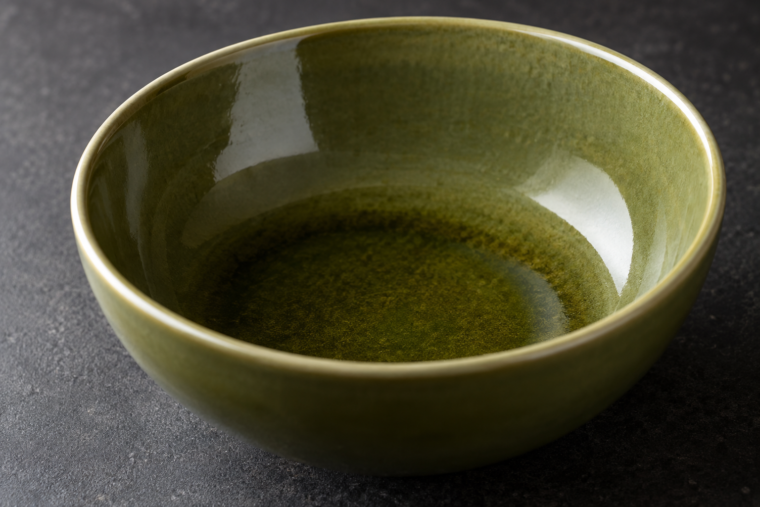
Compare equivalent surface zones before calling a difference a batch problem.
Myth 4: One Beautiful Sample Defines the Whole Order
For a steady solid glaze, a retained master is the main appearance reference. For a reactive finish, I also want physical boundary pieces showing the permitted variation.
The boundaries should describe more than “light” and “dark.” A green can become too yellow, too blue, or too gray without being obviously lighter. Speckle density, rim effects, and gloss may also need separate limits.
Consider a hypothetical online launch of olive bowls. The hero photo shows one unusually dark piece, while most approved production is lighter. The factory may meet the agreed range, yet customers may still feel surprised. The listing should represent the range people can actually receive.
My judgment standard is simple: can the packing team use the approved pieces to decide what belongs in the same set? If the answer depends on asking the designer every time, the boundary is not clear enough.
Photograph a representative group once the production range is approved. Keep the sample IDs behind that image so the marketing team can trace it back to the physical pieces.
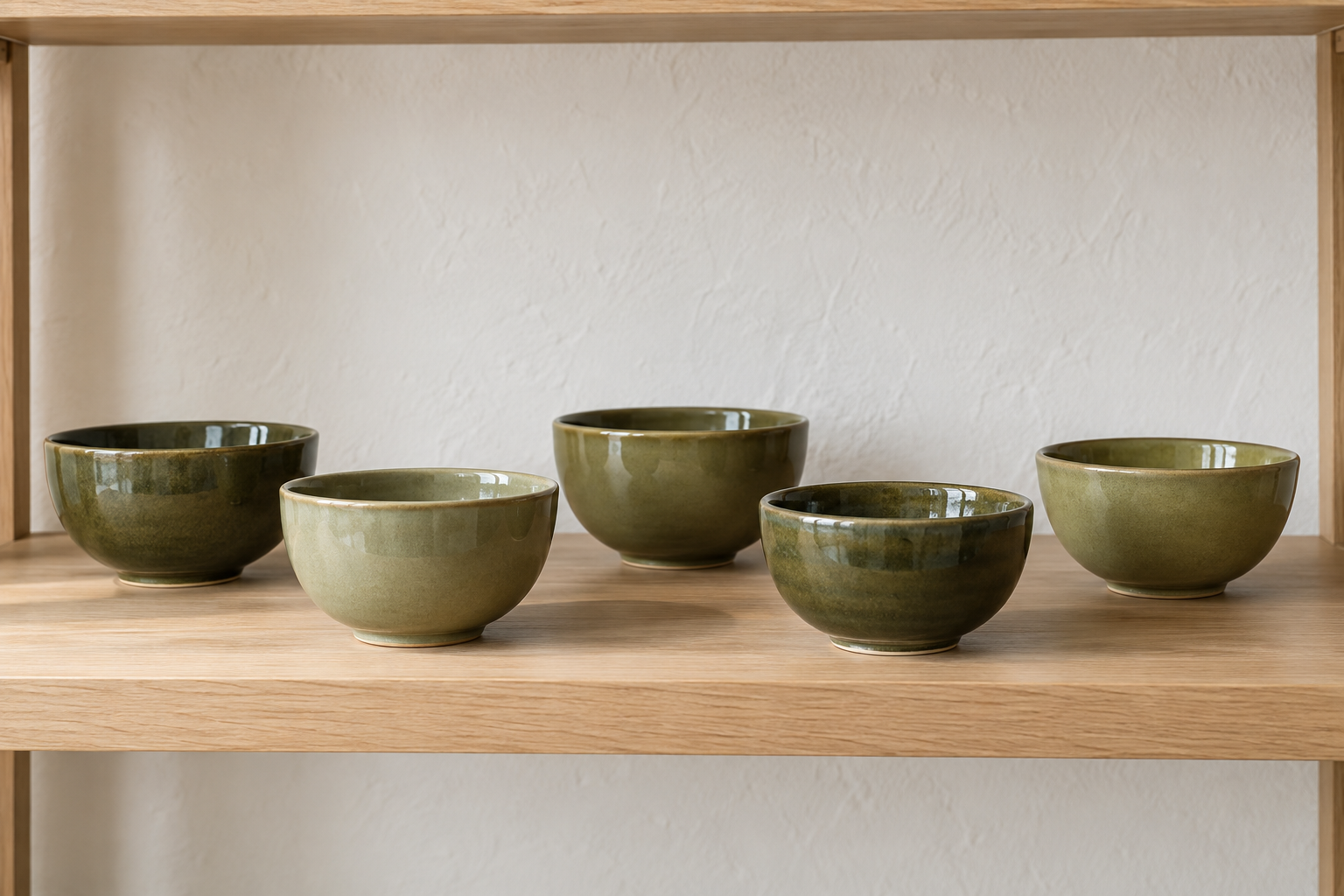
Show the shade range a buyer can expect, rather than an unusually dark hero piece.
Myth 5: Editing the Photo Can Settle a Sample Color Mismatch
Retouching can improve a sales image. It cannot make an out-of-range plate acceptable.
I keep approval images separate from marketing images. Approval images retain the reference card, sample identity, and honest surface detail. Marketing images can have a clean background and a different crop, but should still represent the approved product.
Avoid selective color changes that make a pale bowl appear to match a darker master. If a supplier sends a revised picture, ask what changed: the ceramic, the lighting, or the file? Those are three very different answers.
When a real sample color mismatch is confirmed, record the affected sample or batch and hold the relevant color approval. Agree whether the next step is a corrected sample, a documented range change, or rejection. Do not let a chat message saying “looks fine now” erase the original decision.
Ceramic Dinnerware Color Photos: Your Approval Checklist
I use this short acceptance checklist before a remote review. It checks whether the evidence is usable; it does not replace physical approval.
- Reference and candidate samples appear together, with readable IDs supplied in the accompanying record.
- The light source, background, camera position, and settings are recorded well enough to repeat.
- A neutral reference card appears in a setup image; mixed window and room lighting is avoided.
- Overall, rim, and reflection views show the same identified pieces without selective recoloring.
- Original files are available, and review copies have an identified color profile.
- The review states its purpose: development direction, visible-issue review, or support for physical color approval.
- The final decision names the retained master, any boundary pieces, reviewer, date, and next action.
If the first two boxes are missing, I request a new photo set before commenting on a small shade difference. If the photographs are sound but the decision remains close, I request physical pieces. That is usually more useful than another round of screen comparisons.
My Advice as a Manufacturer
I prefer one repeatable photo station and a clear approval record to a folder full of attractive pictures.
Choose a neutral background, consistent lighting, and a fixed camera position. Separately check the actual pieces under the intended retail or dining light. The first review supports repeatable comparison; the second tells you how the collection will feel in use.
For a large program, instrument readings may support color control. Agree the measurement method, surface location, and tolerance with the supplier first. One universal color-difference number is not a sensible promise for every reactive, curved, or glossy glaze.
Keep the buyer’s and factory’s approved reference sets linked by sample ID. A reference on only one side of the order leaves too much room for disagreement.
Questions Buyers Often Ask
Can I approve ceramic color from a phone photo?
I use phone photos for early direction and obvious issues. Final color approval should refer to actual fired pieces and agreed viewing conditions, especially when a small difference affects the collection.
Does daylight always give the correct color?
Daylight changes with time, weather, and location. I prefer a recorded, repeatable light setup for comparison, followed by a separate check under the intended use lighting.
Should every bowl look identical to the plate?
The agreed collection standard decides that. Compare the shapes together in person. Depth, glaze distribution, and reflection can change appearance even when the pieces share a glaze recipe.
Can the supplier guarantee the color on every customer screen?
No. Buyers can improve photography and file handling, but customer devices and viewing conditions vary. Use representative product images and explain approved variation plainly.
What should I do if bulk goods look wrong?
Compare identified bulk pieces with the retained references under the same conditions. Document any remaining difference and apply the agreed acceptance rules before releasing the affected goods.
Conclusion
Useful ceramic dinnerware color photos make decisions clearer when their limits are understood. I use them to connect the sample, the review record, and the buyer’s expectations. Physical approval pieces remain the reference for the product itself.
If you are preparing a new collection, share your color references, intended sales setting, and current sample photos with FENN. I can help you define a practical photo review brief and the physical samples needed for approval.