
Short Answer
A strong dinnerware color palette starts with one or two hero colors, one dependable neutral, and clear rules for how each glaze behaves on plates, bowls, and mugs. Do not approve colors from digital references alone. Build a fired sample family, define acceptable variation, test the colors together under several lights, and keep a signed palette record for bulk production and repeat orders.
If a brief contains twelve beautiful color references, I would first look for ways to make the range smaller. More colors do not always make a stronger collection. They can create more sampling, more stock, more shade risk, and a shelf that feels noisy.
My simple advice is to give every color a job.
Copy-Ready Palette Passport
I use a short working document for each proposed color. You can copy this structure into your own product brief.
| Passport Field | What to Record | How to Judge a Professional Supplier Answer |
|---|---|---|
| Color role | Hero, neutral anchor, seasonal accent, or replacement color | The supplier understands how tightly this color must match across the range |
| Fired references | Signed plate, bowl, mug, and separate glaze tile | The answer is based on fired ceramic, not a screen image or wet glaze |
| Body and glaze system | Clay body, glaze code, finish, and firing route | Each reference is tied to the actual production recipe and shape family |
| Appearance range | Ideal, light edge, dark edge, and reject examples | Natural variation is shown as a boundary, not described only as “normal” |
| Surface behavior | Pooling, speckling, rim break, pinholes, or movement | Expected effects are separated from true defects |
| Light check | Daylight, warm retail light, and photo setup | The supplier can explain when the shade changes and which light controls approval |
| Range compatibility | Plate, bowl, mug, serveware, and packaging pairing | Curves, glaze depth, and body color have been considered shape by shape |
| Repeat-order record | Batch date, firing record, retained master, and photos | A later order can be compared with physical and production evidence |
The passport makes tableware color planning usable for designers, factories, photographers, quality teams, and future reorder staff.
Give Each Color One Clear Role
Hero Color
The hero color carries the collection’s main feeling. It may be a deep green, soft blue, or warm rust. It deserves the most development time because buyers will notice it first and replacement orders must still feel related.
I normally ask: Does this color remain attractive on a broad dinner plate, inside a deep bowl, and around a mug handle? A glaze that looks rich in a bowl may look weak on a flat plate because there is less depth for the glaze to collect.
Neutral Anchor
A neutral gives the eye a rest and helps the hero color sell. Warm white, oatmeal, soft gray, or charcoal can also reduce the need to place every item in a difficult glaze.
The neutral still needs control. Warm white can turn yellow under retail light. A pale matte glaze may show cutlery marks or dark clay through thin areas. Ask for real-use and cleaning checks, not only a color chip.
A FENN Reference for Quiet Color: Moss Mist
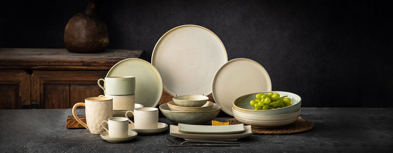
FENN’s Moss Mist collection brings muted green tones together with pale neutrals. Its collection photograph shows plates, bowls, and cups as one range. I would use it to explain how a soft green can carry the identity while pale pieces give the eye a rest.
For your own palette passport, assign a role to each shade before choosing every shape. The photo is a design reference, not a color standard: request fired samples to judge the actual hue and finish together.
Accent Color
An accent should add energy without forcing you to stock a full second collection. I prefer to use it on a mug, side plate, small bowl, or serving piece first. If demand is uncertain, keep the accent on an existing shape so you do not combine color risk with new-mold risk.
A FENN Reference for Accent Color: Spring Sketch
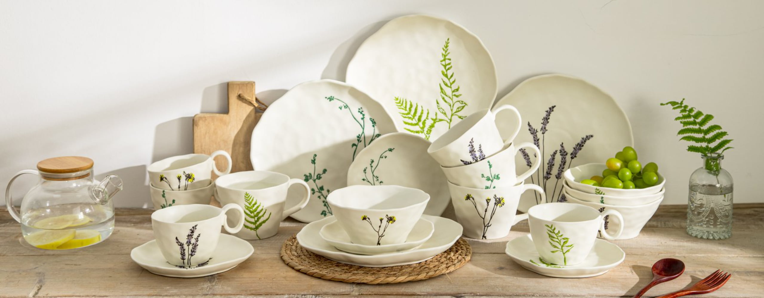
FENN Spring Sketch uses botanical illustrations on a light background. In its range photograph, green, purple, and small yellow details add color without covering the whole surface.
That gives a buyer another option: carry the accent through decoration while keeping a shared light base. I would record both the base shade and the decoration colors in the passport. A shared background does not make different pigments or decorations interchangeable for approval or testing.
Build the Palette in Four Gates
This process keeps color decisions in order. It also stops a good digital mood board from becoming an unmanageable production range.
Gate 1: Screen Direction
Use mood boards and digital values to communicate direction, not final acceptance. Screens vary, files use different color spaces, and ceramic glaze reflects light in a different way from paper or pixels. The International Color Consortium color-management overview gives useful background on why device color needs managed profiles.
At this gate, agree on the feeling and color family. Do not promise an exact fired result yet.
Gate 2: Fired Tile Family
Ask the factory for several fired trials on the intended clay body. A good trial set should show a useful range, not four pieces selected because they look identical. Record recipe, application, kiln batch, and tile position where practical.
The CIE guidance on colorimetry is a high-trust technical reference for measured color. A color reading can support communication, but it does not replace visual review of glaze flow, gloss, texture, and curved surfaces.
Gate 3: Shape Transfer
Move the chosen trials onto one real plate, bowl, and mug. This is where many palettes change. Vertical walls collect glaze differently. Rims can break lighter. Speckles can look dense in a small area and sparse on a dinner plate.
Judge the pieces as a set from normal table distance, then inspect each one close up. A supplier answer is stronger when it explains which effects come from geometry and proposes separate approval limits for different shapes.
A FENN Shape Reference: Forest Glow

The Forest Glow range photograph shows a warm rim and speckled surface details across plates, bowls, and cups. Look at how much of each effect is visible inside a bowl compared with a broad plate or a cup wall.
I would ask a supplier to identify which features should repeat and which may vary by shape. Record rim coverage and speckle appearance separately from the background shade. This photograph supports that design discussion; it does not define a production tolerance or prove that every shape uses one recipe.
Gate 4: Pilot Range and Photography
Produce enough pilot pieces to see normal variation, make a real place setting, build a working stack, and photograph the range. Review the result in daylight, warm indoor light, and the lighting used for product images.
Use a controlled gray reference and fixed camera settings for comparison. The goal is not to make every photo laboratory-perfect. It is to stop exposure, white balance, or editing from hiding a production difference.
Use a Compatibility Gate, Not a Perfect-Match Promise
Ceramic color matching is not the same as printing one ink on flat paper. Clay body color, glaze thickness, firing atmosphere, kiln position, surface curve, and finish all affect what the eye sees.
I divide range review into three decisions:
| Decision | Buyer Question | Practical Approval Rule |
|---|---|---|
| Same color, same shape | Will repeat plates sit comfortably together? | Compare several fired pieces against a retained plate master and agreed edge samples |
| Same color, different shapes | Do plate, bowl, and mug read as one family? | Approve harmony at table distance; allow shape-specific behavior already shown in masters |
| Different colors, one setting | Do hero, neutral, and accent support each other? | Build a complete place setting and remove any color that fights for the same visual role |
“Exact match” is often the wrong instruction for a reactive or flowing glaze. “Anything is acceptable because it is handmade” is also wrong. The useful standard sits between them: a visible and signed family of acceptable results.
Keep the Palette Safe to Sell and Repeat
Color choice also touches materials and market requirements. Pigments, glaze composition, decoration, food-contact area, and product use must match the compliance plan for the destination.
For U.S. context, the FDA guidance on lead in foodwares is a sensible starting point. For EU sales, the European Commission food contact materials overview explains the wider framework. These pages do not approve a specific glaze. Ask for evidence that matches the actual item, color, decoration, and market.
For repeat orders, store a clean retained set away from strong light and damage. Link it to glaze codes, body, sample date, production batch, approved photos, and the acceptance range. If the body or glaze recipe changes, treat it as a new approval event.
Common Palette Mistakes to Avoid
- Choosing five hero colors when the sales plan can support only one.
- Approving a tiny flat tile and assuming every shape will look the same.
- Mixing matte, glossy, reactive, and solid glazes without a clear range logic.
- Describing variation with words but keeping no physical edge samples.
- Editing product photos until the online color no longer represents the goods.
- Forgetting that replacement plates may sit beside pieces bought a year earlier.
- Adding a new glaze late, after packaging, photography, and SKU plans are fixed.
My Advice as a Manufacturer
Start with three roles: one hero, one neutral, and one controlled accent. If two colors do the same job, remove one before sampling more SKUs.
Approve the palette in layers: fired tiles, real shapes, a complete place setting, and a small pilot range. Keep the physical masters and reject edges together with the production record. From a factory point of view, that is far more useful than a message asking us to make the next order “a little warmer.”
Use the three FENN references above to explain your priorities: a quiet color family, a decorated accent, or a repeated rim-and-speckle effect. Each needs a different approval record.
Questions Buyers Often Ask
How many colors should a first dinnerware collection have?
There is no universal number, but a tight first palette is easier to sample, stock, photograph, and repeat. One hero, one neutral, and an optional accent is a useful starting structure.
Can a factory match a Pantone color exactly in ceramic glaze?
A Pantone reference can communicate direction, but it cannot guarantee an exact ceramic result. The clay, glaze, firing, finish, lighting, and shape all change the appearance. Approve fired samples and a range.
Should every piece use exactly the same glaze recipe?
Not always. Different shapes may need controlled process adjustments to achieve a related visual result. Any adjustment should be documented and approved on the real shape.
How do we approve a reactive glaze palette?
Approve an ideal piece plus light, dark, flow, speckle, and rim-effect boundaries. Review several pieces together and define clear reject conditions.
What should we keep for repeat orders?
Keep a signed plate, bowl, and mug master; acceptable edge samples; glaze and body codes; dated photos; batch information; and the agreed inspection method.
Conclusion
A useful dinnerware color palette is not simply a row of attractive shades. It is a small color system with clear roles, fired proof, shape-by-shape judgment, safe market evidence, and repeat-order records. Build that system before you expand the SKU count, and the collection will be easier to sell, control, and grow.
Develop Your Dinnerware Color Palette With FENN
Contact FENN with your target customer, shape list, color references, sales market, and launch quantity. We can review the color roles and plan a focused fired-sample round before you expand the range.