
Short Answer
Good dinnerware retail packaging helps shoppers identify the shape, color, and quantity while protecting the ceramic piece. I start with the actual shelf, then plan the display sample, carton face, color names, and scanning position together. Before approving artwork, ask for a packed prototype and rehearse how store staff will display, scan, and replace it.
A beautiful box can still leave a shopper asking, “Is this the green bowl or the blue one?” That small doubt is where I would start the design review.
My working definition: shelf-ready dinnerware is a product-and-packaging arrangement that staff can stock correctly and customers can understand without unnecessary unpacking. Here, I mean the whole selling arrangement, not only a tear-open shipping tray.
Copy This Shelf Brief Before Artwork Starts
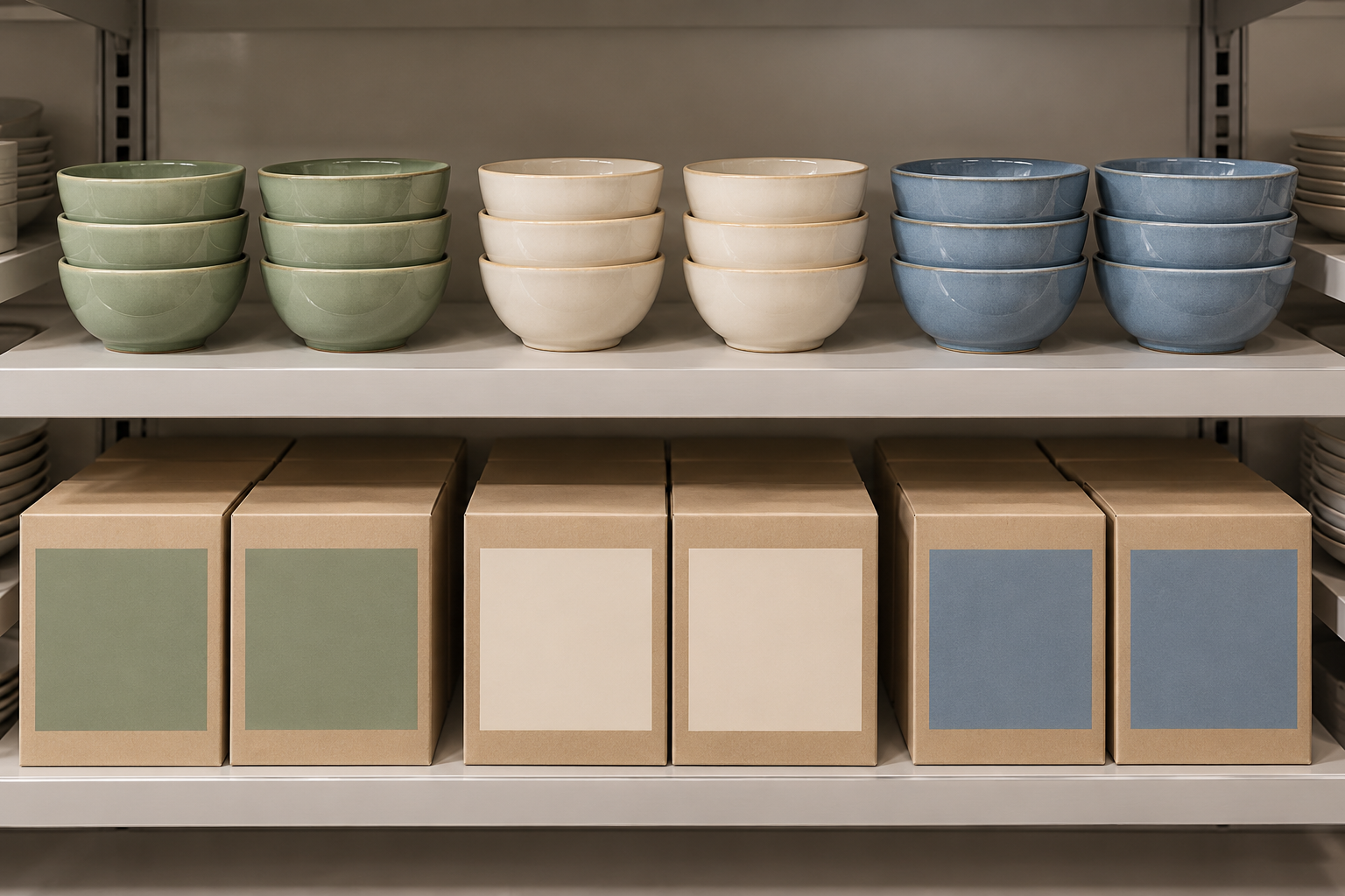
I prefer one shared brief for the ceramic factory, packaging supplier, and retail team. Otherwise, each team may solve a different problem beautifully.
Use the fields below for one selling unit. Repeat them when the set size or packaging structure changes.
| Brief field | What to enter | What a useful supplier response includes |
|---|---|---|
| Selling unit | Single bowl, four bowls, or mixed dinner set | Exact contents, SKU, packed weight, and outside dimensions |
| Shelf position | Usable width, depth, height, and planned orientation | Full-size mockup with room to lift the pack out |
| Display method | Open stock, protected window, or sample beside closed stock | How customers see the glaze and how staff maintain the display |
| Color identity | Customer color name and internal glaze reference | Same naming across carton, shelf label, order file, and product data |
| Visible information | Shape, size, quantity, color, and key care wording | Artwork shown in the actual shelf-facing orientation |
| Handling route | Receiving, stockroom, shelf, checkout, and carry-home | Protection and grip points suited to the filled pack |
| Scan and restock | Retailer barcode requirements and stockroom-facing panel | Printed prototype, data match, and retailer acceptance check |
| Approval ownership | Named owners for ceramic, packaging, artwork, and retail checks | One version record tying all approvals together |
Keep dimensions measured on the finished pack. A flat artwork file cannot tell you whether a shopper can grip the box below the shelf above it.
For ceramic dinnerware shelf display, I also ask how many pieces will actually be shown. A deep display stack can hide the bowl shape; a single unsupported upright plate needs a stable holder. The merchandising plan should specify both the display quantity and the support.
Fill the Brief for One Real Selling Unit
Imagine a retailer launching four soup bowls in sage, ivory, and blue. This is a planning example, not a FENN customer case.
A weak instruction is: “Make three attractive boxes to match the collection.”
A more useful instruction is: “Each closed carton contains four bowls in one color. Show one representative bowl above the matching stock. Put the color name and four-bowl quantity on the front; repeat the item identity on the stockroom-facing side. Check the filled carton in our shelf fixture before printing.”
That second version answers several costly questions early. It tells the packer whether colors are mixed. It tells the designer which face matters. It tells the store whether a display sample is needed.
Now ask the retailer to remove one box and put it back. Can the next box slide forward without catching? Does the display bowl block access? Is the carton too deep for the fixture? These are useful checks even when the packaging looks lovely in a presentation.
I would request photographs of the mockup from customer height and from the restocking side. A supplier response showing only a front-facing render is still missing the handling story.
Give Dinnerware Retail Packaging Two Color References
Printed board and fired glaze are different surfaces. A flat ink patch cannot reproduce the depth, reflections, or variation of a ceramic glaze.
I keep two references: an approved fired sample range for the ceramic, and an approved print proof on the chosen packaging material. The printed color helps identify the product; it does not replace the ceramic approval standard.
For a reactive finish, choose a display piece that represents normal production. Do not select the most dramatic bowl for every photograph if most delivered pieces will look quieter. Also review plates, bowls, and mugs together: different curves and glaze thicknesses can change how one color appears across a collection.
X-Rite’s explanation of metamerism describes why two colors can match under one light and differ under another. My practical response is to compare the printed pack and fired samples under agreed viewing conditions, including the intended store lighting where possible.
Use a readable color name as well as a color patch. “Sage” is easier for customers than an internal glaze number, while the factory still needs that exact internal reference. If two shades are close, staff should not have to decide from the patch alone.
A strong approval record identifies the board, print finish, proof version, ceramic references, and viewing conditions. “Color approved” beside an emailed image is too thin a record for repeat orders.
Choose How the Customer Will See the Glaze
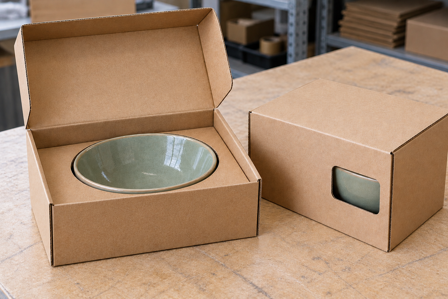
There are three practical routes, and each needs a different check.
Open stock: customers can inspect and handle individual pieces. Check stack stability, removal effort, and where the foot of one piece contacts the next. Rough contact areas can mark the display during repeated handling. Agree the display height using actual production samples, not a single perfect stack.
A window pack: customers see part of the actual product while most of it remains covered. Position the opening away from vulnerable rims and handles, and keep internal supports doing their job. Ask the packaging supplier to show how the opening changes the structure. A larger window is not automatically a better design.
Closed stock with a display sample: cartons can stay sealed while the glaze remains visible nearby. This often gives a cleaner shelf, but staff need a way to keep the sample with the correct SKU. Include a replacement plan for chipped, missing, or outdated display pieces.
My preference depends on the store’s handling pattern. For a heavy set, I would rather customers inspect a separate sample than repeatedly open a loaded carton in the aisle.
Whatever the route, test the final filled packaging for its intended distribution conditions. A shelf mockup checks merchandising and access; it does not prove transport protection. Changing a window, insert, board grade, or set weight can justify another packaging review.
Make the Small Information Easy to Find
Tableware packaging design has to answer ordinary questions quickly: what is inside, how many pieces, which color, and which size?
Put those answers where customers can read them in the planned display orientation. If the box sits on its side, a beautiful top panel may be invisible. If the artwork shows a complete table setting, make the sold contents clear so a four-bowl pack does not suggest that plates are included.
For identification, use GS1 barcode guidance alongside the retailer’s requirements. Confirm the relevant symbol, placement, print quality, and clear area with the responsible team. Do not let a fold, seam, sticker, or glossy finish undermine scanning.
A checkout trial with the printed, filled pack is useful, but it does not replace any formal barcode verification the retailer requires. Check that the scanned item description matches the color and pack quantity too.
Care and safety wording need a separate evidence check. The FDA’s lead in food and foodwares guidance explains that lead in pottery can leach into food. A reassuring color palette or “natural” description is not evidence of food-contact suitability.
Ask the relevant team to match product claims to the actual body, glaze, decoration, intended use, and destination requirements. A packaging designer should receive approved wording, not be expected to invent it.
Rehearse a Restock Before Approving the Print Run
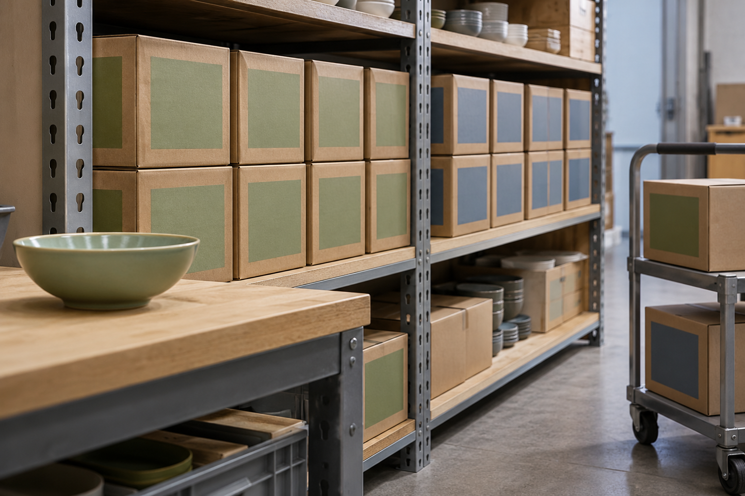
I like a simple rehearsal: give someone the stockroom carton and ask them to replenish the shelf using only the proposed labels.
Watch where they hesitate. Can they tell sage from blue without opening the box? Does the selling unit look different from the outer shipping carton? Can they locate the right shelf position after another customer has moved the sample?
Record each hesitation as a specific change: repeat the color name on the side, enlarge the quantity, move the product image, or revise the display-sample holder. Avoid a vague note such as “make it clearer.”
Then retain a complete reference set: the approved fired samples, packed prototype, print proof, shelf photograph, and product-data version. If a reorder changes the bowl profile or carton supplier, check whether the original shelf and protection approvals still apply.
My Advice as a Manufacturer
I would rather discover a shelf problem with an unprinted prototype than with a warehouse full of finished cartons. Ceramic sizes vary within agreed tolerances, so the insert and display should work with the approved range, not only one chosen sample.
Bring the retail team into that review early. The factory knows how the bowl is made; the store knows how it will be handled. A good brief lets both sides make a better decision.
Questions Buyers Often Ask
Should the box color exactly match the glaze?
Use it as an identification cue. Approve print and ceramic references separately, then judge whether they communicate the same color honestly under the agreed lighting.
Is a window always better than a product photograph?
No. A window can reveal the real glaze, but it may change protection and handling. A representative display sample with closed stock may suit the store better.
Can one carton design serve every color?
Often, if the correct color name, SKU, image or patch, and barcode data are controlled. Check how labels are applied and verified during packing.
Does a shelf-ready box also work for online shipping?
Not automatically. Parcel delivery creates a different handling route. Review the complete shipping pack and its validation separately.
What should we approve before bulk printing?
The filled prototype, visible information, ceramic and print references, retailer identification requirements, and handling rehearsal. Keep the approved versions together so later changes are traceable.
Bring Your Shelf Plan to the Packaging Review
If you are developing dinnerware retail packaging, share your selling-unit contents, shelf dimensions, glaze samples, and retailer requirements with FENN. I can help turn those details into a practical brief for the ceramic and packaging review. For related buying topics, visit our Resources hub.